- July 30, 2025
- Liz Potarazu
Let’s start with a radical truth: color is not just aesthetic. It’s neurological. Emotional. Even medicinal.
The (not-my-favorite) truth is that we spend 90% of our time indoors. Let’s view that stat as an opportunity: color can be more than just paint on the walls—it can be a tool for well-being. Whether you’re designing for calm, clarity, or a boost of joy, the hues you choose shape how you feel. Literally. And the science is clear: how we feel in a space starts with what we see.
So how do we design with color that doesn’t just look good, but actually does good? Here’s the cheat sheet, backed by research and made for real life:
Warm Tones: The Spark
Think reds, corals, and sun-drenched yellows. These hues ignite attention, activate energy, and in the right doses, trigger dopamine release—the same feel-good brain chemical that floods in moments of joy, connection, and (yes) love. Perfect for kitchens, home offices, or anywhere that benefits from a gentle nudge into “let’s do this” mode.
Design Tip: Use bold shades to stimulate—but anchor them with neutrals or nature-based materials (think clay, wood, linen) to avoid overwhelm. A vibrant backsplash? Yes. Chartreuse chairs? That’s a hell yes! A crimson ceiling in your bedroom? Eh, probably not.
Cool Tones: The Soother
Blues and greens are nature’s lullabies. These shades activate the parasympathetic nervous system, which helps regulate stress and lower heart rate. In short: they calm us down. That’s why you’ll find sage walls in spas, navy in meditation corners, and soft mint in therapy offices.
Design Tip: Use these tones where you want restoration and clarity—bedrooms, bathrooms, or any space meant to lower the volume on the world.
“The amygdala—our brain’s emotional response center—activates when we see disharmonious colors, suggesting our brains react emotionally and almost instantly to color, even before we process it consciously. “


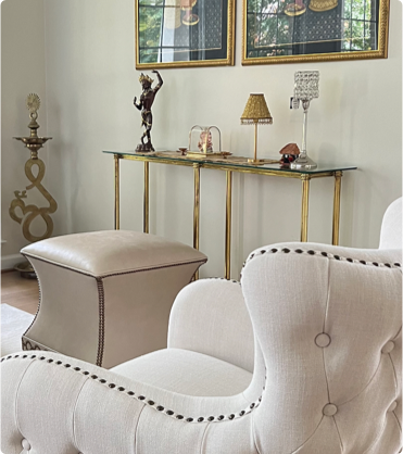
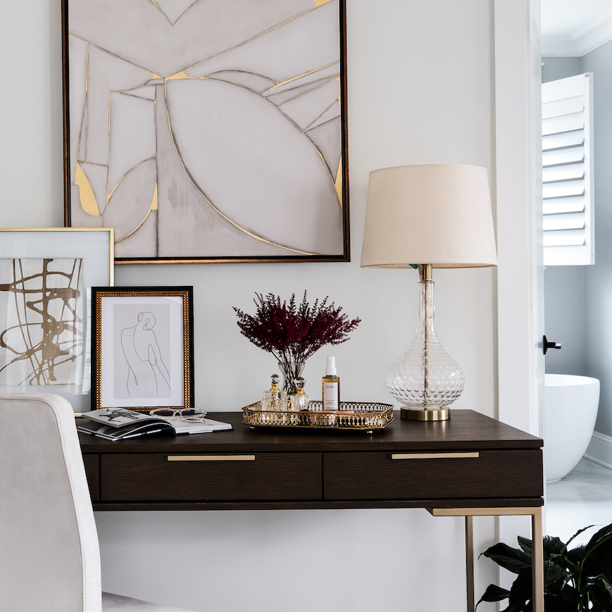
Muted Tones: The Grounding Force
Earthy tones like taupe, dusty rose, and terracotta don’t just look timeless—they feel timeless. They’re easier for the brain to process, which means they reduce cognitive load and help us feel safe. These are the unsung heroes of emotional regulation.
Design Tip: Don’t underestimate “boring” colors. In reality, they’re doing some heavy lifting. They let your nervous system exhale.
Dopamine Decor: The Joy Hack
For those craving more sparkle in their surroundings, dopamine decor offers a joyful jolt. Think nostalgic hues, bold patterns, and emotionally meaningful objects. When done right, it’s not chaos—it’s chemistry.
But a word of caution: too much stimulation can become, well, too much. Especially for neurodivergent brains (hi! ✋it’s me and my ADHD brain). The key is intentionality. Sprinkle in color where it counts—a sunny yellow desk chair, a punchy piece of art—and let the rest of the room breathe.
Color is one of the most accessible, affordable, and underutilized wellness tools in your home. When chosen with purpose, it becomes more than pretty—it becomes powerful.
At LP & Co., we design with both palette and purpose, creating spaces that don’t just photograph beautifully—they feel like a deep exhale or that motivational song that gets you ready to crush a day at your desk. Need help finding your color sweet spot? We’re here, swatch book in hand. Schedule your 15-minute Discovery Call.